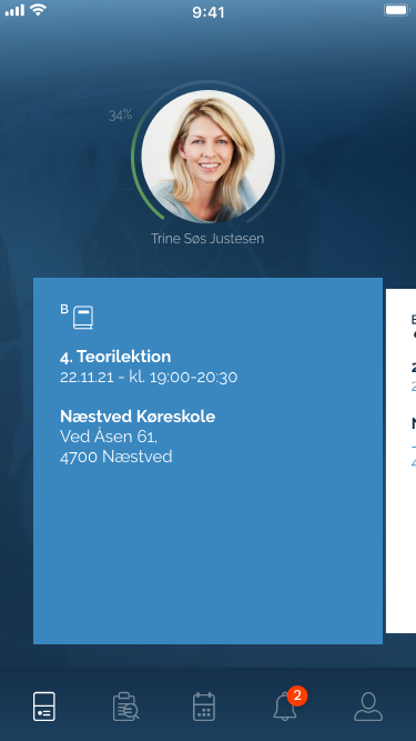
The Dashboard contains all the students lessons and events(Signed and unsigned) sorted by time and date. I only see one lesson/event at the time but when I swipe left og right a new one appears. This gives the student always an overview of signed and upcoming lessons/Payment (If the Driving School have the add-on Payment).

(See attached video for animation: When you swipe: The lesson you swipe becomes a little smaller and the upcoming lesson/event becomes bigger at the same time).
Lesson box must contain: Lesson type Icon, Headline/lesson no., date and time. Location + icon and address. See attachment.

Colors for lesson boxes
Teorilektion/Theory lesson #3A87C0 (azure blue) /
Kørelektion/Driving lesson #FFFFFF (white)
Manøvrebane/Maneuvering track #A9B6D6 (light purple)
Førstehjælpskursus/First aid course #BD7378 (indian red)
Køreteknisk anlæg/Road safety Center #BED9ED (Light blue)
Teoriprøve/Theory test #A88E53 (Gold)
Køreprøve/Driving test #90732F (Dark Gold)
Betaling/Payment #214E71 (Aegean Blue)

After all lessons/events are Signed they have the same design: Colors, fonttype and checkmark:
Bg color Dark Blue #1E3A55
Font type: Headline: Bold text: Regular
Check mark: bg color Dark Blue #1E3A55 and white #FFFFFF border and checkmark

Except if it has been signed:
"Self study" color is Yellow #E8D440
"Requires repetition" and "not completed" color is dark orange #C77B2F
See more on this under each User Story for Theory Lesson, Driving Lessons and events.

All icons are either White #FFFFFF or Dark Blue #1E3A55
Click on a lesson/event will open popup window with lesson info where student kan read info and sign the lesson.
Bottom menu have highlighted the Dashboard white #FFFFFF icon and others: Lesson plan, Calendar, Notifications and profil are also white #FFFFFF but only 50% opacity.