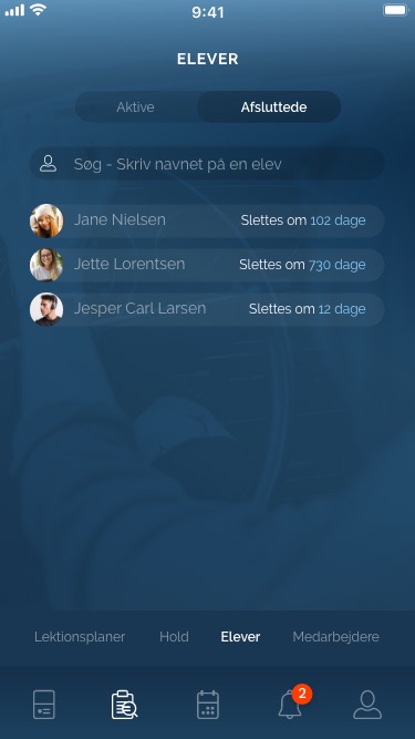
The page is showing a list of all active and inactive students. The search input field: type an letter/name and below students will showing if there is a watch. It should work just like in the WebApp.
All active students created in the WebApp are showing here

The student bg box have the same width like the search field

Students are divided into "Active" and "Completed" students. This is displayed at the top, where there are two menu items: "Active" and "Completed". When you are on the "Active" page, the text in 100% opacity is highlighted in white and the font weight is "Semi bold". Completed teams are displayed in 50% opacity white and font weight "Regular". click on each to navigate between the two team pages. The bg menu-box is 12% opacity black and the bg-box for selected page is also 12% opacity black. In this case the selected menu will appear more dark.

There are two types of active students: Affiliated with a team or be without a team

Affiliated with a team
The instructor can affiliate the student with a team under the student info page "Valg og pris(Choice and price)". Or when the student sign up a team via the website.

Design
Long bg box is black opacity 12%. Student name is white. Team no. (coming when the instructor create a new team) is light blue #91CDF8

Be without a team
The student will be without a team after the last Theory Lesson is signed by the Instructor and Student, this happens automatically in the system. After that the Student doesn't need to be on a team because all the Theory has ended (this is also a indicator for the Instructor that the student has ended the Theory).

Design
Student picture. Long bg box is white opacity 12%. Student name is white. Text "Uden hold/without a team" white opacity 50%

The student list is alphabetic A-Z from the top

Click on each Student (the long bg box) and you go to the info student page
Search box: same as "Active Students"

List of all completed students

The student bg box have the same width like the search field

Students are divided into "Active" and "Completed" students. This is displayed at the top, where there are two menu items: "Active" and "Completed". When you are on the "Complete" page, the text in 100% opacity is highlighted in white and the font weight is "Semi bold". Active teams are displayed in 50% opacity white and font weight "Regular". click on each to navigate between the two team pages. The bg menu-box is 12% opacity black and the bg-box for selected page is also 12% opacity black. In this case the selected menu will appear more dark.

Design
Student picture. Long bg box is white opacity 5%. Student name is white 50% opacity. Text "Slettes om" white and "xxx dage" is light blue #91CDF8

The student list is alphabetic A-Z from the top

Click on each Student (the long bg box) and you go to the info student page

I don't think this below is made in the WebApp? If not, we can wait until all other user stories in the WebApp/App are made and ready for use for a real Driving School and Instructors:

Dage(days) is also a counter that count 2 years(730 day) down from the day the student has passed the Driving test(the last test to become the Driver License). After the 730 days counted down the Student profile will be deleted automatic in the system (It's a legal requirement that the Driving School should save the students profile/info/Lesson plan for two years, but after that the Student and al info will be deleted.

